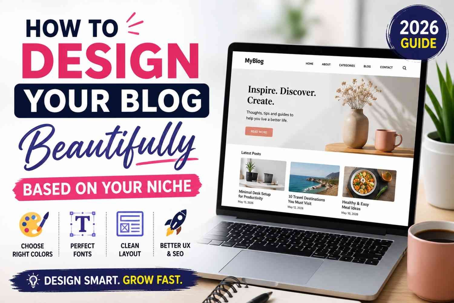
Your first step in how to design your blog beautifully is to understand your readers. Your blog design should help them trust your content within seconds.
Studies show people judge a website in about 0.05 seconds, and around 94% of first impressions come from design. That is why a clean layout, simple colors, and easy navigation matter before anyone reads your first line.
Why Every Niche Needs a Different Design
A good design matches what your readers expect. Therefore, one design never works for every blog.
| Blog Niche | Best Design Style |
|---|---|
| Tech & AI | Clean, modern, simple |
| Health | Calm, spacious, fresh |
| Food | Bright, image-focused |
| Travel | Large photos, colorful |
| Personal Finance | Professional, minimal |
| Parenting | Warm, friendly, soft colors |
What You Will Learn
After reading this guide, you will know how to:
- Choose the right layout for your niche
- Pick colors that match your audience
- Select easy-to-read fonts
- Build a homepage that keeps visitors reading
- Improve user experience for Google Search and AI search engines
- Make your blog look professional without hiring a designer
A beautiful blog is not about adding more colors or effects. Instead, it is about helping your readers find answers quickly, enjoy every page, and trust your website from their very first visit, which is the real goal of how to design your blog beautifully.
Why Blog Design Matters More Than Ever in 2026
Your blog design is your first impression. A clean and useful website design helps people trust you within a few seconds.
Good design also helps people stay longer. As a result, they read more pages and remember your brand.
Better User Experience Builds Better Results
User experience (UX) means how easy your blog feels to use. If visitors find what they need quickly, they are more likely to stay.
Simple menus, clear headings, and enough white space make reading easy. Therefore, your visitors enjoy every page without feeling lost.
Does Blog Design Affect SEO?
Yes, but not by itself. Good blog design supports better SEO because it improves page speed, readability, and user experience.
Google recommends creating pages that load fast, respond quickly, and stay visually stable. In 2026, good Core Web Vitals targets are:
| Metric | Good Score |
|---|---|
| Largest Contentful Paint (LCP) | Under 2.5 seconds |
| Interaction to Next Paint (INP) | Under 200 milliseconds |
| Cumulative Layout Shift (CLS) | Below 0.1 |
These signals help create a better experience for real users.
Why AI Search Experience Matters
Today, people also search through AI tools. Therefore, your blog should be easy to scan, fast to load, and simple to understand.
A clear layout helps AI systems understand your content better. It also increases your chance of being cited in AI-generated answers.
Build Trust Through Design
People judge your blog before reading your words. A neat layout, readable fonts, and matching colors make your website look reliable.
On the other hand, messy pages reduce confidence. Many visitors leave without reading anything.
Increase Engagement and Reduce Quick Exits
Good design keeps readers moving through your blog. They click related articles, explore categories, and spend more time on your website.
However, poor design often causes quick exits. Instead of chasing a lower bounce rate, focus on helping visitors complete their task easily.
Build a Strong Brand Authority
Your design should look the same across every page. Consistent colors, fonts, images, and buttons help people recognize your blog.
Finally, a beautiful blog design makes your content easier to read, builds trust, improves engagement, and supports long-term SEO success.
Choose Your Blog Design Based on Your Niche
Your blog niche design should match what your readers expect to see. A good design builds trust fast and helps people stay longer on your website.
Do not copy another successful blog. Instead, design your blog around your own topic and your readers’ daily needs.
Every niche has its own style because every audience thinks differently. For example, a travel reader loves large photos, while a finance reader wants clean charts and easy navigation.
A simple and fast layout works better than a fancy one. In 2026, most successful blogs focus on readability, speed, and mobile-first design instead of heavy animations.
Choose the Right Design for Your Niche
| Niche | Best Design Style | Recommended Colors | Best Layout | Font Style |
|---|---|---|---|---|
| Tech | Minimal | Blue, White, Gray | Grid | Sans-serif |
| AI | Modern, Futuristic | Purple, Black | Card Layout | Sans-serif |
| Finance | Professional | Navy, White | Structured | Serif + Sans-serif |
| Health | Clean | Green, White | Spacious | Rounded Sans-serif |
| Recipes | Bright | Orange, Cream | Image-first | Friendly Sans-serif |
| Travel | Visual | Sky Blue, White | Magazine | Elegant Serif |
| Parenting | Soft | Pastel Colors | Comfortable | Rounded Sans-serif |
Tech Blog Design
If you run a tech blog, keep everything simple and clean. Readers come for information, so remove visual clutter and use a clear grid layout.
Use blue and white because they create a professional feeling. Also, choose a modern sans-serif font to improve reading on every screen.
AI Blog Design
An AI blog should feel modern from the first second. Therefore, use card layouts, dark sections, and purple highlights without making the page heavy.
Keep enough white space between sections. This makes complex AI topics easier to understand.
Finance Blog Design
Finance readers look for trust before they read your advice. Therefore, use a professional layout with clear headings and simple navigation.
Avoid bright colors and playful designs. Navy blue and white help your website look more reliable.
Health Blog Design
Health blogs should make readers feel calm and comfortable. Use green, plenty of white space, and clean images.
Keep paragraphs short and easy to scan. Readers often visit health articles on mobile devices.
Food and Recipe Blog Design
Food blogs need attractive photos more than long introductions. Therefore, place large recipe images above the fold.
Use warm colors because they make food look more appealing. Also, keep recipe cards easy to read.
Travel Blog Design
Travel readers want to imagine the destination immediately. Use full-width images and magazine-style sections to create that feeling.
Show destination photos before long text. This keeps visitors interested and encourages scrolling.
Parenting Blog Design
A parenting blog should feel warm and welcoming. Soft colors and rounded fonts help parents feel relaxed while reading.
Keep buttons large and menus simple. Busy parents should find information within a few seconds.
Quick Design Tips for Every Blog
- Keep your homepage clean.
- Use only two or three main colors.
- Choose one heading font and one body font.
- Leave enough white space.
- Make every page mobile friendly.
- Compress images for faster loading.
- Keep navigation simple.
- Use the same design across all pages.
Google also rewards websites that are fast, responsive, and easy to use. Modern blogs now follow a content-first and mobile-first approach because it improves user experience and search visibility.
The best blog design based on niche is the one that helps your readers find answers quickly. When your design matches your audience, your blog looks professional, builds trust, and keeps visitors coming back.
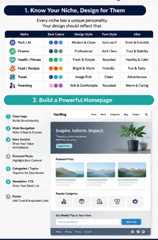
Build a Beautiful Blog Homepage Readers Love
Your blog homepage is the first page many people see. A good homepage layout builds trust within seconds and helps visitors find the right content quickly. Web design influences about 94% of first impressions, so every section should have a clear purpose.
Start with a Clear Hero Section
Place a simple hero section at the top. Then tell visitors what your blog helps them achieve in one short heading and one short description.
Add one clear button, such as Start Here or Read Latest Posts. This helps new readers know what to do next.
Show Your Best Featured Posts
Display only your top 4–6 featured posts. Also choose articles that solve your readers’ biggest problems first.
Organize Content with Categories
Create simple categories that match your niche. Then keep category names short and easy to understand.
| Blog Niche | Good Categories |
|---|---|
| Tech | AI, Software, Windows, Android |
| Food | Breakfast, Dinner, Snacks, Desserts |
| Travel | Guides, Budget Trips, Hotels, Packing |
| Health | Diet, Fitness, Mental Health, Yoga |
Add a Search Bar
Place the search bar near the top menu. Therefore, readers can find any article in just a few seconds.
Grow Your Email Newsletter
Add one small newsletter box after your featured posts. Then tell readers exactly what they will receive every week.
Use a simple message like:
- Weekly blog tips
- Free guides
- New articles first
- No spam
Display Popular Articles
Show your most-read articles with clear thumbnails. This also keeps visitors on your website longer because they quickly discover valuable content.
Finish with a Useful Footer
Keep your footer clean and helpful. Include only the pages readers usually need:
- About
- Contact
- Privacy Policy
- Disclaimer
- Categories
- Social Media Links
- Copyright
A beautiful blog homepage always stays simple, fast, and easy to use. When your homepage layout helps readers find useful content without confusion, they stay longer, trust your blog more, and return again.
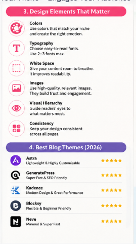
Pick Colors That Match Your Audience
Your blog color palette should match your readers before it matches your favorite color. The right website colors help people trust your blog and stay longer.
Why Blog Color Psychology Matters
People notice colors within seconds, and they often judge a website before reading the first line. In a 2025 Adobe survey of 1,000 U.S. consumers, 54% said blue is the most trusted brand color, while 16% notice a brand’s colors before anything else.
Choose one main color, one supporting color, and one accent color. This simple rule keeps every page clean and easy to read.
Choose Colors for Your Blog Niche
| Blog Niche | Best Blog Colors | Feeling You Create |
|---|---|---|
| Tech & AI | Blue, Purple, White | Trust and innovation |
| Personal Finance | Navy Blue, Green | Security and growth |
| Health & Wellness | Green, White | Freshness and calm |
| Food & Recipes | Orange, Red | Warmth and appetite |
| Travel | Sky Blue, Sand | Freedom and adventure |
| Parenting | Soft Blue, Pink, Yellow | Care and happiness |
Use Colors with a Purpose
- Trust colors: Blue and green build confidence and reliability.
- Luxury colors: Black, gold, and dark gray create a premium look.
- Fun colors: Yellow, orange, and bright pink add energy and excitement.
- Professional colors: Navy, white, and gray keep your blog clean and serious.
Keep Your Color Palette Simple
Use only 3 to 5 colors across your entire website. Too many colors confuse readers and weaken your brand.
Keep dark text on a light background for easy reading. Also, use one bright accent color only for buttons and important links, so visitors know where to click next.
Key Takeaway
The best blog colors are the ones your audience expects from your niche, not the ones you personally like. A smart blog color palette builds trust, improves readability, and gives your blog a professional look from the first visit.
Typography That Makes People Keep Reading
Good blog fonts and clean typography make your content easy to enjoy. They also help visitors stay longer because every line feels comfortable to read.
Choose Simple Blog Fonts
Pick only one font for headings and one for body text. This keeps your blog clean and gives every page the same style.
Some of the best fonts for blogs are:
- Headings: Poppins, Montserrat, Manrope
- Body text: Inter, Roboto, Open Sans, Lora
These fonts load fast and stay clear on both desktop and mobile screens.
Pair Fonts the Right Way
Do not mix many fonts because they confuse readers. Instead, use simple font pairs like these:
| Heading Font | Body Font | Best For |
|---|---|---|
| Poppins | Inter | Tech and AI blogs |
| Montserrat | Roboto | Business blogs |
| Playfair Display | Lora | Travel and lifestyle blogs |
| Manrope | Open Sans | Health and education blogs |
Use Easy-to-Read Heading Sizes
Your headings should guide readers from one section to the next. Therefore, keep a clear size difference between each heading.
- H1: 36–48px
- H2: 28–32px
- H3: 22–26px
- Body text: 16–18px
This simple structure helps readers scan your article much faster. ([Medium][3])
Keep Paragraph Spacing Comfortable
Short paragraphs look clean and reduce eye strain. Also, leave one empty line between paragraphs so every idea stands out.
Use these simple rules:
- Write 2–3 short sentences per paragraph.
- Keep each line around 50–75 characters.
- Avoid long text blocks.
These small changes improve readability on every device. ([NamasteDev][4])
Set the Right Line Height
Leave enough space between lines because crowded text feels hard to read. A line height of 1.5–1.6 works well for most blog posts.
Readers can follow each line easily without losing their place.
Check Mobile Readability
More than half of blog visitors now read on their phones, so always test your design on a small screen before publishing. Keep body text at 16px or larger, use high color contrast, and make every heading easy to tap and read.
Good blog fonts and smart typography make every article look professional. As a result, your readers enjoy the experience, stay longer, and are more likely to return to your blog.
Layout Secrets Used by Successful Blogs
A successful blog layout helps your readers find answers without getting confused. When your design feels clean and simple, people stay longer and trust your content more.
Use White Space Smartly
White space gives every section enough room to breathe. As a result, your text becomes easier to read and your page feels more professional.
Do not fill every corner with ads, banners, or widgets. Instead, leave enough space between headings, images, and paragraphs so your readers can focus on your content.
Keep the Content Width Comfortable
Your content should stay narrow enough for easy reading. Most successful blogs use a content width of 700–900 pixels, which reduces eye movement and improves readability on desktop screens.
On mobile devices, let your layout adjust automatically. Therefore, always use a responsive design that looks good on every screen size.
Use Images That Teach
Every image should explain something useful. Likewise, use screenshots, charts, infographics, or real examples instead of decorative pictures.
Keep image sizes optimized for fast loading. Also, add clear alt text because it helps both accessibility and SEO.
Add Simple Tables
Tables help readers compare information within seconds. Therefore, use them whenever you explain features, prices, tools, or methods.
| Element | Best Practice |
|---|---|
| White space | Keep enough spacing between sections |
| Content width | Around 700–900 px |
| Images | Use helpful and compressed images |
| Tables | Compare information quickly |
| TOC | Place below the introduction |
| Callout boxes | Highlight tips and warnings |
| Sticky navigation | Keep important links visible |
Include a Table of Contents (TOC)
A clickable Table of Contents (TOC) lets readers jump directly to the section they need. It also helps search engines understand your page structure and may improve search result visibility.
Place the TOC near the beginning of long articles. Then keep every heading short, clear, and easy to scan.
Highlight Important Points
Callout boxes make useful information stand out. For example, use them for:
- Quick tips
- Expert advice
- Common mistakes
- Warnings
- Pro recommendations
Readers notice these boxes faster than normal paragraphs. Therefore, they improve learning without making the page look crowded.
Keep Navigation Visible
A sticky navigation bar stays at the top while readers scroll. This makes moving around your website faster, especially on long guides.
However, keep it small and clean. Too many sticky elements can block the screen and reduce the user experience.
Key Takeaways
- Use plenty of white space for better readability.
- Keep your content width around 700–900 px.
- Add useful images instead of decorative ones.
- Use tables for quick comparisons.
- Place a clickable TOC below the introduction.
- Highlight important tips with callout boxes.
- Keep sticky navigation simple and distraction-free.
A clean blog layout always helps your readers finish your article with less effort. As a result, your website looks more trustworthy, feels more professional, and encourages visitors to come back again.
Best WordPress Themes for Every Blog Niche
Choosing the right WordPress blog theme is one of the easiest ways to build a fast and professional blog. The best WordPress themes help your pages load quickly, improve SEO, and give your readers a better experience.
Today, most successful bloggers choose lightweight themes instead of heavy designs. They are easier to customize, work well on mobile devices, and support Google’s Core Web Vitals for better search performance.
Compare the Best WordPress Themes
| Theme | Speed | SEO | Customization | Ease of Use | Best For |
|---|---|---|---|---|---|
| Astra | ⭐⭐⭐⭐⭐ | ⭐⭐⭐⭐⭐ | ⭐⭐⭐⭐⭐ | ⭐⭐⭐⭐⭐ | Beginners and all blog niches |
| Kadence | ⭐⭐⭐⭐⭐ | ⭐⭐⭐⭐⭐ | ⭐⭐⭐⭐⭐ | ⭐⭐⭐⭐☆ | Bloggers who want more design control |
| GeneratePress | ⭐⭐⭐⭐⭐ | ⭐⭐⭐⭐⭐ | ⭐⭐⭐⭐☆ | ⭐⭐⭐⭐☆ | Speed-focused and SEO blogs |
| Blocksy | ⭐⭐⭐⭐⭐ | ⭐⭐⭐⭐⭐ | ⭐⭐⭐⭐⭐ | ⭐⭐⭐⭐⭐ | Creative, portfolio, and business blogs |
| Neve | ⭐⭐⭐⭐☆ | ⭐⭐⭐⭐☆ | ⭐⭐⭐⭐☆ | ⭐⭐⭐⭐⭐ | New bloggers and small websites |
Which Theme Should You Choose?
- Choose Astra: if you want hundreds of ready-made starter templates and simple setup.
- Choose Kadence: if you want flexible headers, footers, and page layouts.
- Choose GeneratePress: if your main goal is maximum speed and clean code.
- Choose Blocksy: if you want modern designs with many customization options.
- Choose Neve: if you need a beginner-friendly theme that is easy to manage.
GeneratePress is widely known as one of the fastest WordPress themes available today. Astra, Kadence, and Blocksy also deliver excellent speed when they are properly configured. ([TeamUpdraft][2])
Many WordPress users also prefer Kadence because it offers strong customization without slowing down the website. Community discussions regularly recommend Kadence and GeneratePress for fast loading and SEO-friendly websites.
Practical Recommendation
If you are starting your first blog, choose Astra or Neve because they are simple to learn. If you already know WordPress and want the best balance of speed, SEO, and flexibility, choose Kadence, GeneratePress, or Blocksy. Your WordPress blog theme should always stay lightweight, mobile-friendly, and easy to customize for long-term growth.
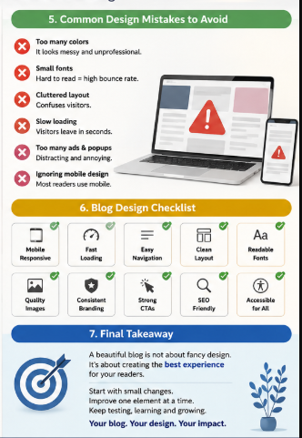
Common Blog Design Mistakes That Make Your Blog Look Unprofessional
Your blog design creates the first impression within a few seconds. If it looks messy, many people leave before reading your first paragraph.
Too Many Colors
Using many bright colors makes your blog look confusing. Instead, use 2 to 3 main colors that match your niche and keep every page consistent.
Tiny Fonts
Small text tires your readers very quickly. Therefore, use a body font size between 16 and 18 pixels because it is easy to read on both desktop and mobile.
Slow Loading Pages
A slow website makes visitors leave without waiting. Even worse, page speed affects user experience, and Google still uses Core Web Vitals as one of many ranking signals for page quality. ([Nico Digital][1])
Popups Everywhere
Too many popups interrupt your readers. Instead, show one popup only after they spend some time on your page or reach the end of your article.
Poor Spacing
Long text blocks look heavy and difficult to read. So, keep short paragraphs, enough white space, and clear gaps between headings, images, and lists.
Too Many Ads
Too many ads hide your real content and reduce trust. Keep ads limited, and always let your content stay as the main focus.
No Visual Hierarchy
Readers should instantly know where to look first. Therefore, use clear headings, larger titles, featured images, bullet lists, and bold text to guide their eyes naturally.
Quick Blog Design Checklist
| Mistake | Better Choice |
|---|---|
| Too many colors | Use 2–3 brand colors |
| Tiny fonts | Use 16–18 px body text |
| Slow pages | Compress images and improve loading speed |
| Many popups | Show only one popup at the right time |
| Poor spacing | Add white space between sections |
| Too many ads | Keep content above ads |
| No visual hierarchy | Use headings, images, and bullets clearly |
A clean blog design helps your readers stay longer, trust your content, and enjoy every page. When you remove these simple mistakes, your blog looks more professional and becomes easier to read and navigate.
Blog Design Checklist Before Publishing
Before you publish, check your blog design checklist one last time. A few small checks can make your blog look more professional and easier to use.
Final Blog Design Checklist
| Checklist Item | What You Should Check |
|---|---|
| ✅ Mobile responsive | Your blog looks perfect on phones, tablets, and desktops. |
| ✅ Fast loading | Every page opens quickly. Google recommends a good Largest Contentful Paint (LCP) within 2.5 seconds for a better page experience. |
| ✅ Accessible | Use clear colors, readable text, and image alt text so everyone can use your blog. |
| ✅ SEO optimized | Add one H1, proper headings, a meta description, internal links, and keyword-rich image alt text. |
| ✅ Easy navigation | Keep your menu simple. Help visitors reach any page in one or two clicks. |
| ✅ Internal links | Link to related articles. This keeps readers on your website for longer. |
| ✅ Consistent branding | Use the same logo, colors, fonts, and button style on every page. |
| ✅ Clear CTAs | Tell readers what to do next: subscribe, read another article, or contact you. |
| ✅ High-quality images | Use sharp images that match your topic. Compress them to keep your website fast. |
| ✅ Readable typography | Choose easy-to-read fonts. Keep body text around 16–18 px with enough spacing. |
A beautiful blog is not only about colors and pictures. It should also be fast, simple, and easy to read.
As of 2026, Google still values page experience, mobile usability, and Core Web Vitals alongside helpful content. Also, recent web performance studies show that only about 48% of mobile pages pass all Core Web Vitals, so improving speed gives your blog an advantage.
Finally, review this blog design checklist before every new post. This simple habit helps you build a beautiful blog that readers trust and enjoy.
Frequently Asked Questions
Does blog design affect SEO?
Yes. A good blog design helps both your readers and search engines understand your website better.
Also, Google rewards pages that load fast, work well on mobile, and give a smooth user experience through Core Web Vitals.
Which colors increase trust?
The right colors depend on your niche. However, some colors often create trust faster.
| Color | Best For |
|---|---|
| Blue | Tech, Finance, AI |
| Green | Health, Nature |
| White | Minimal, Medical |
| Dark Gray | Business |
| Navy | Corporate |
| Soft Orange | Food, Lifestyle |
Keep your main color simple. Then, use one accent color for buttons and important links.
Should every niche use different layouts?
Yes. Your blog layout should match what your readers expect.
For example:
- Tech blogs: Clean card layout
- Food blogs: Large recipe photos
- Travel blogs: Full-width images
- Finance blogs: Simple and professional
- Parenting blogs: Soft colors and easy navigation
Your design should help people find information quickly. That keeps them reading longer.
What width should blog content be?
Most successful blogs keep the content width between 700 and 850 pixels. This width feels comfortable on both desktop and mobile screens.
Short lines reduce eye strain. Therefore, your readers can finish longer articles more easily.
Should I use a sidebar?
Yes, but only when it adds value. Otherwise, remove it to keep your page clean.
You can use a sidebar for:
- Popular posts
- Categories
- Search box
- Newsletter signup
Avoid filling it with too many ads or widgets. They often distract your readers.
Which fonts improve readability?
Simple fonts work best. They make your content easier to scan.
Good choices include:
- Arial
- Inter
- Roboto
- Open Sans
- Lato
- Georgia
Keep your body text around 16–20 px. Also, leave enough space between lines for comfortable reading.
Can AI create blog designs?
Yes. AI tools can create layouts, color palettes, logos, and page ideas within minutes.
Still, you should review every design yourself. Your blog should match your niche, brand, and readers instead of looking like every other website.
What makes a blog look premium?
A premium-looking blog design feels clean, fast, and easy to use. It also helps readers focus on your content instead of distractions.
Use this simple checklist:
- Fast loading pages
- Mobile-friendly layout
- High-quality images
- Plenty of white space
- Consistent colors
- Clear headings
- Easy navigation
- Readable fonts
- Few advertisements
- Strong branding
Finally, remember this: the best blog design is not the most colorful one. It is the one that helps your readers find answers quickly and enjoy every page.
Final Thoughts
A beautiful blog design based on your niche helps your readers trust you from the first visit. It also makes your content easier to read, keeps people longer, and supports better SEO in 2026.
Do not redesign your whole blog in one day. Instead, check your current blog first and improve one design element at a time.
Start with these simple checks:
- Match your colors to your niche.
- Choose easy-to-read fonts.
- Keep your homepage clean.
- Remove anything that creates clutter.
- Test your blog on mobile devices.
- Make every page load as fast as possible.
Small changes bring better results over time. Therefore, review your blog every few months and fix anything that no longer helps your readers.
Remember this simple rule: your design should always support your content, not compete with it. When your blog looks clean, loads fast, and matches your niche, visitors feel more confident and are more likely to return.
Finally, keep improving your beautiful blog design based on your niche with every update. One smart change today can help your blog grow stronger, build more trust, and create a better experience for every visitor tomorrow.